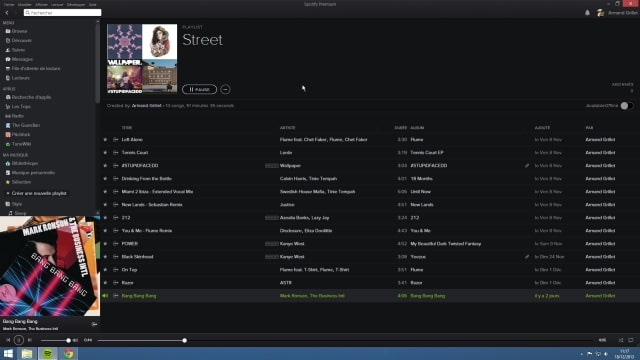
Spotify is quietly rolling out a sleeker, new look to its Windows and Mac Desktop applications, according to several users across the web.
The new look is much darker, but features larger text, rounded images and filtered artwork. Generally, you see less information with this new look, but it does give a more cleaner look for the app.
Artist pages, for example, work in much the same way as they did before. By default they'll show you less tracks on a single page, a dark filter has been applied to the 'cover' image, and each artist now has a circular avatar, but all the same information will be available to users — there's no massive interface change, just a fresh coat of paint. The changes give more of a Google+ feel, perhaps reinforcing Spotify's desire to be a 'social network' for music.
Similar tweaks have been made throughout the app, with larger fonts and more empty space added everywhere. The Discover tab has been reconfigured to display a grid of suggestions, rather than an organic mash of different-sized boxes; track sharing options have been replaced with attractive graphics; and the playback controls also have a new look. The changes make the app perhaps less intuitive than before — a square box saying 'share' is clearer than the three abstract dots that replace it — and the new look will likely take some getting used to.
The update is labeled as version .9.8, and Spotify has yet to push out any details of the update, but the build is slowly making its way to Spotify users. The update is most likely a soft rollout, so if you do not see it at first, we recommend you try again in a few days.
Read More [Download] via TheVerge


